Where does the money go?
Watch out, here comes a lot of text! This is a call to the graphically savvy ones among you: Help us to visualise the following lines in one or several illustrations.
There are various illustrations on the internet, designed to depict the exact allocation of costs of a product. The purpose of it is to meet the need of people who want to find out - preferably in a simple, straightforward way - whether those involved in the production process (employees/workers, management, company owners, dealers/retailers, North, South, ...) are actually given a "fair" or "unfair" share in the profits. Good idea. So how come there is no such simple and clear illustration for the NagerIT mouse?
After we have compared different illustrations and discussed various new approaches, we have come to the conclusion that our production process is just way too complex, as to be illustrated in a simple diagram which would come even close to the truth in terms of justice among the people involved. On the contrary, we believe that such seemingly simple yet informative depictions are prone to easily mislead the readers rather than to illuminate the actual circumstances.
The challenge we have yet to find a solution for lies in the fact that while we indeed know the prices for the services and components of our mouse from our 20 direct suppliers, it still doesn't reveal much. Around 1000 people in over 100 companies are involved in the production process of our mouse (see supply chain).
For example, in order for us to state how much the employees and workers are getting paid, we need facts and figures from every single company about how long these employees work on each component of our mouse and how much money is being spent by each company on planning, marketing, management, material etc. We only know a smattering of these facts and figures though. But even if we had sufficient information, it still wouldn't reveal much unless depicting the effort in relation to the wage as well. How does one classify health risks, business risks, responsibility for others, etc. in order to illustrate which pay is fair and which is not? (Interested in a more detailed example? Please click here)
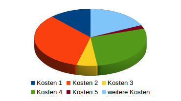
We believe that an illustration as depicted above (containing made-up figures) will create more misunderstandings than it will actually answer any questions. As far as we can see, it would rather suggest a content it just doesn't comply with.. And we would like to prevent that. Therefore, for the time being, we will stick to disclosing our supply chain as transparently as possible. In our opinion, that's the best way to illustrate the issue, even though the lack of any actual numbers and figures might suggest an objective possibility of evaluating the problem. That said, we are of course always open to any suggestions that may help us out of this dilemma.
We are happy to receive your ideas on how we might illustrate this issue in a clear and descriptive way without scaring off our readers with too much dry and indigestible text. Feel free to send your ideas or comments to: